Article: Razzle Dazzle Bold Graphic Design for Social Good
Razzle Dazzle Bold Graphic Design for Social Good
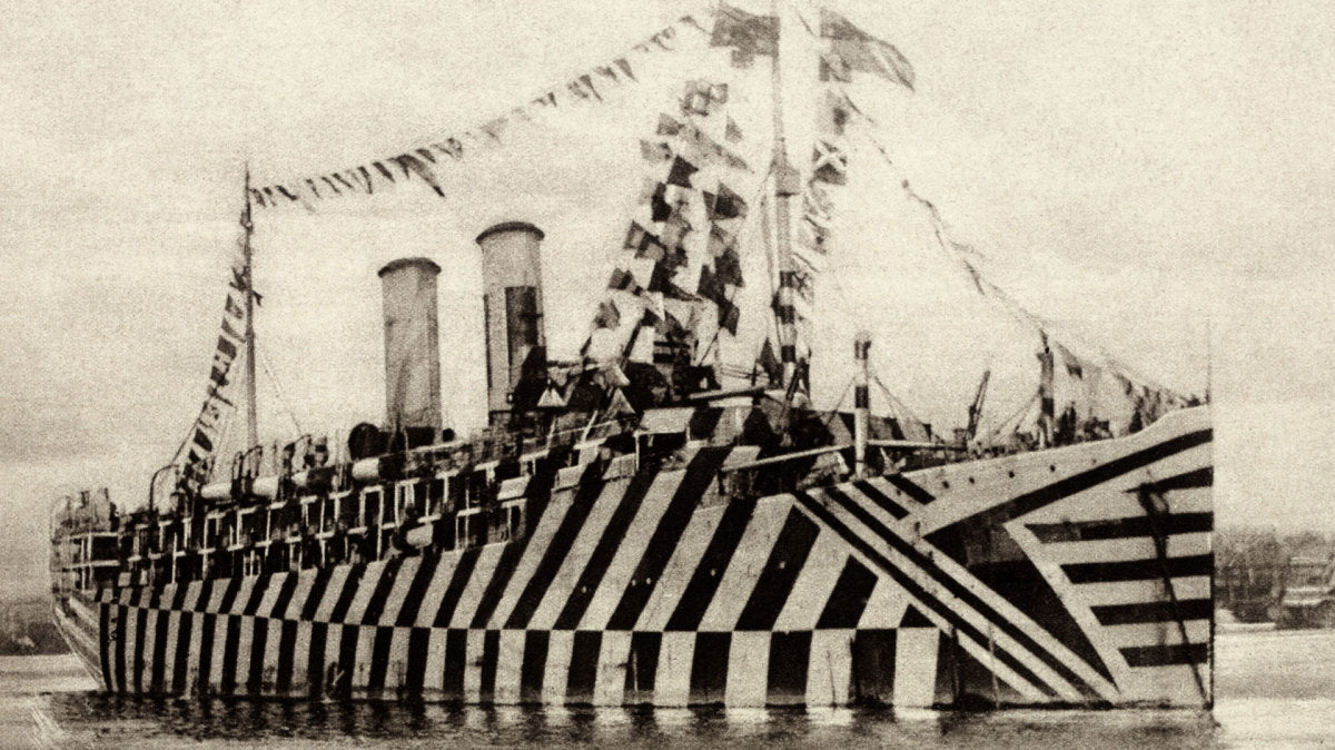
Who knew that graphic design could hide ships from torpedoes during WWI? Know as Dazzle Camouflage, or Razzle Dazzle as it was known in the US, bold color blocking, zig zags and high contrast patterns interrupted the form of the ship. Unlike other forms of camouflage, the intention was not to conceal but to confuse. Ridiculous an idea as it might seem, far from being an act of desperation it was based on sound scientific research, visual perception and misinformation.

Figure 1: Dazzle design, Type 15 (port side), lithograph hand-coloured with gouache on wove paper, c.1917, 242 x 765 mm, RA 09/1269 © Royal Academy of Arts, London.
How does it work?
Take a zebra for example: it is believed according to zoologist H, Cott, that stripes make it difficult for a predator to distinguish one from another when the zebras are in a large herd. This is called disruptive camouflage.
“The function of a disruptive pattern is to prevent, or to delay as long as possible, the first recognition of an object by sight... irregular patches of contrasted colors and tones ... tend to catch the eye of the observer and to draw his attention away from the shape which bears them.”
The same idea with the interchanging high contrast colors and dark tones disrupted the form of the ships from view so that enemy torpedoes could not appropriately gauge their range, speed or heading. Each ship had a unique pattern based on the design and contour and often included false bow waves to create an illusion of movement.
Who created it?
Credited to the British artist Norman Wilkinson who came with this idea in 1917, a time when German U-Boat attacks on British ships seemed unstoppable.
Norman Wilkinson recalls: “I suddenly got the idea that since it was impossible to paint a ship so that she could not be seen by a submarine, the extreme opposite was the answer — in other words to paint her, not for low visibility, but in such a way as to break up her form and thus confuse a submarine officer as to the course on which she was heading.”

Figure 2: Dazzle design, Type 15 (port side), lithograph hand-coloured with gouache on wove paper, c.1917, 242 x 765 mm, RA 09/1269 © Royal Academy of Arts, London.
With high-contrast patterns to confuse enemies on submarines and enemy cruisers as to the ship's range, speed and heading. Each ship's Dazzle pattern was unique to avoid making classes of ships instantly recognizable to the enemy.


Influence on Design and Art
This flamboyant new visual language inspired artists like Picasso, Braque and other Cubist painters. Others attributed it as a play on the abstract chaos of Italian Futurist art. Artist such as Edward Wadsworth, who supervised the camouflaging of over 2,000 ships during the First World War, painted a series of canvases of dazzle ships that inspired design movements.

Graphic Poster by Edward Wadsworth


Abstract Composition by Edward Wadsworth
The historian of camouflage Peter Forbes comments that the ships had a Modernist look, their designs succeeding as avant-garde or Vorticist art.

Two American ships in dazzle camouflage, painted by Burnell Poole, 1918

"Oympic with returned soldiers" painted by Arthur Lismer

Bathing Suits inspired by Dazzle Camouflage
Dazzle camouflage is arguably one of the most strikingly aesthetic tools of war ever employed. A great example of graphic design for social good - and inspiring us today as camouflage evolves once again
Source:
Marter, Joan M. (2011) “The Grove Encyclopedia of American Art’”
Forbes, Peter (2009). “Dazzled and Deceived: Mimicry and Camouflage.”
Roy R. Behrens(1999) “The Role of Artists in Ship Camouflage during World War I”
Cott, Hugh B. (1940) “Adaptive Coloration in Animals.”